
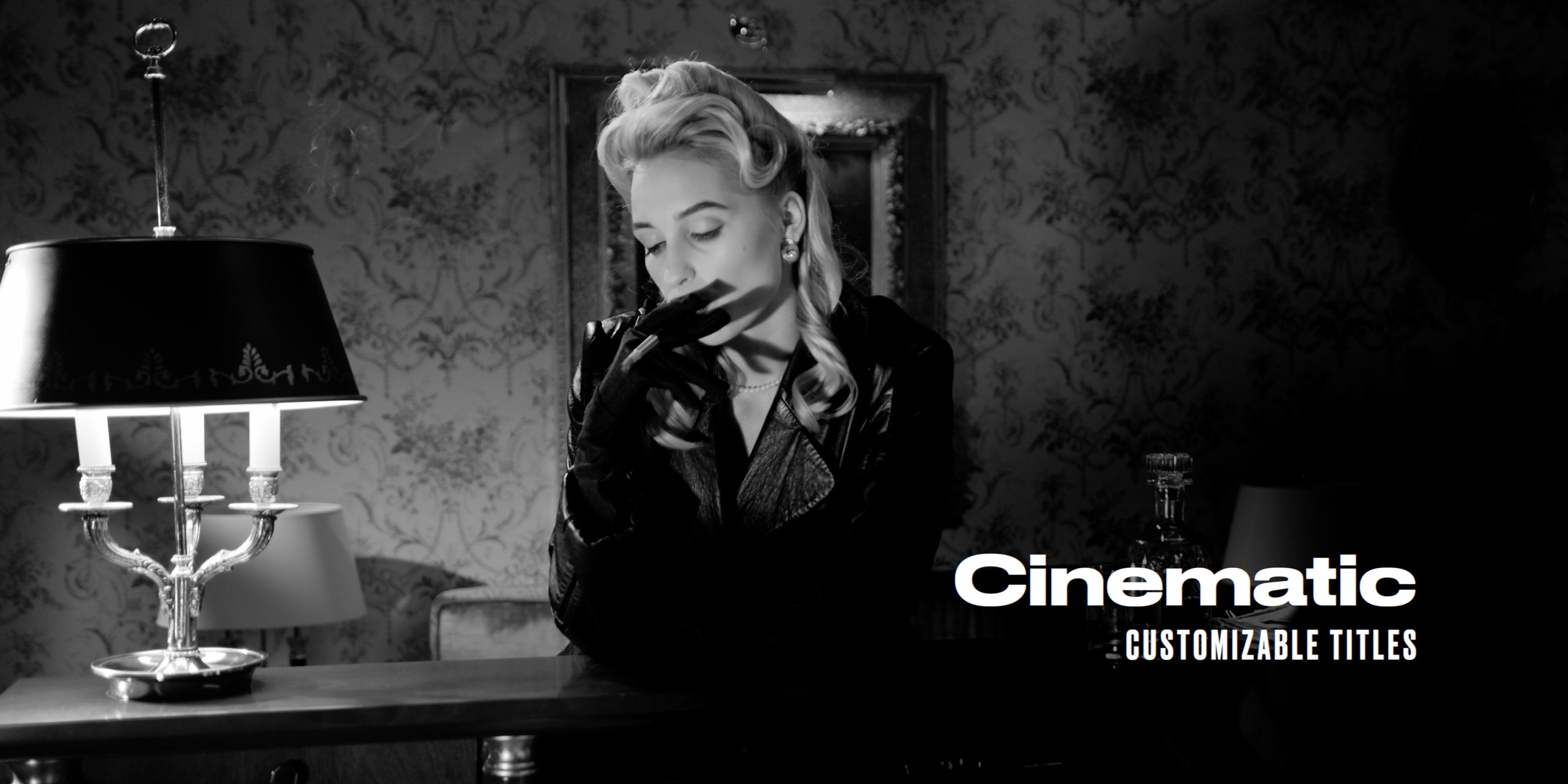
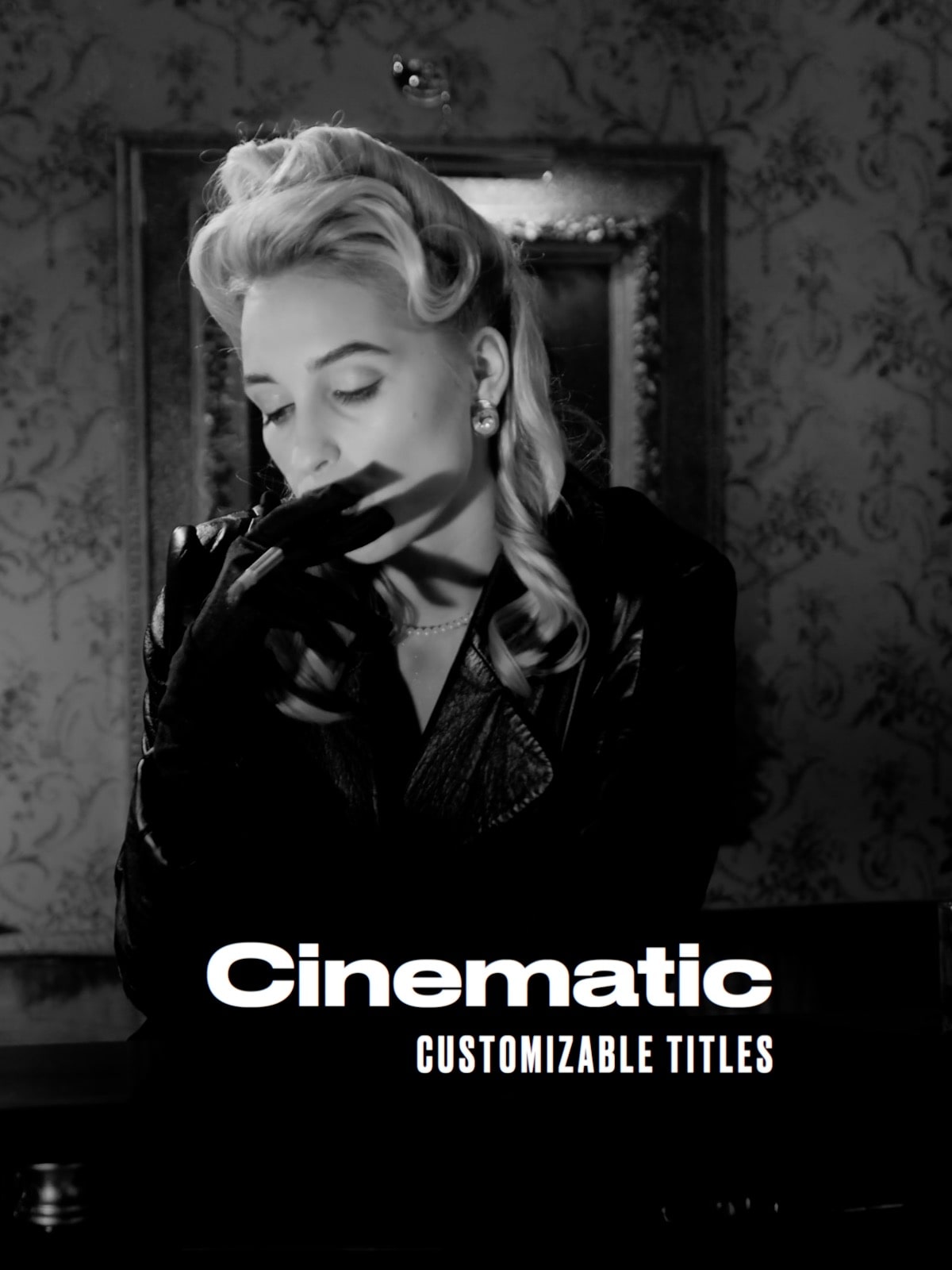
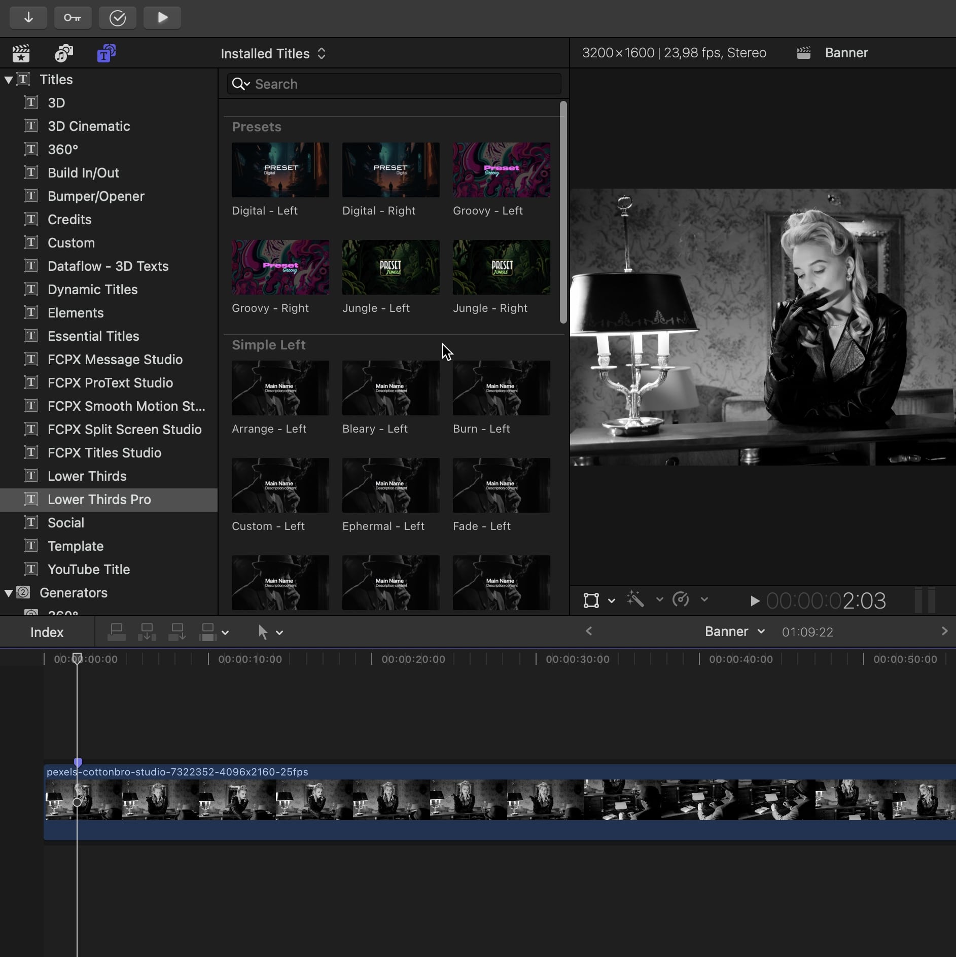
Lower Thirds Pro
Take your Final Cut Pro videos to the next level with our pack of 25 elegant Lower Thirds. With three categories to choose from and 11 professional animations, you can easily resize and place your conten in the perfect spot with on-screen controls. Project a shadow, edit the blur value and opacity in a click. Add an auto-size box or border, round the corners and change its color.
Easy to use
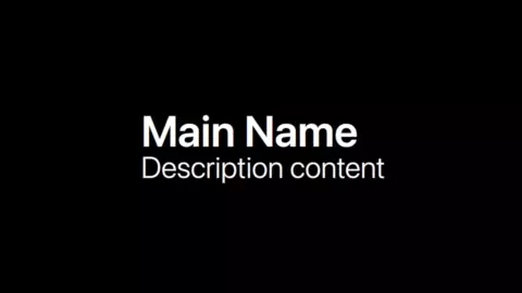
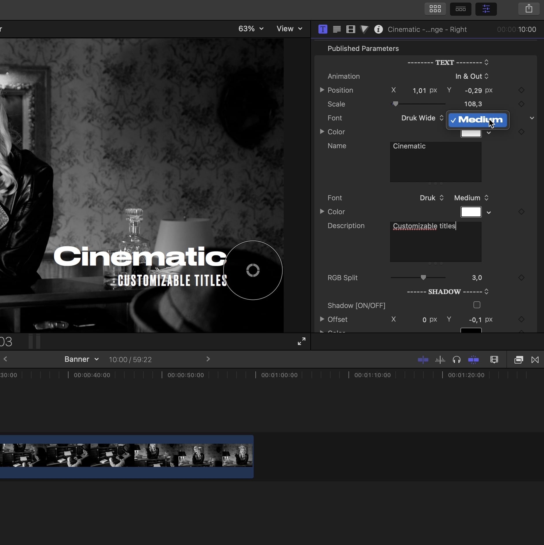
Choose the base for you lower third: left side, right side, with logo or preset... Preview the different animations in the title inspector and drag and drop to the timeline. Use the on screen controls to easily change the text, positionate and scale the title.
Customizable
Start from one of the simple and subtile default look and customize the font, color, layout, add a box, borders, shadow, etc... Give your lower third the tone you want to match the style of your edit!
Professional looking
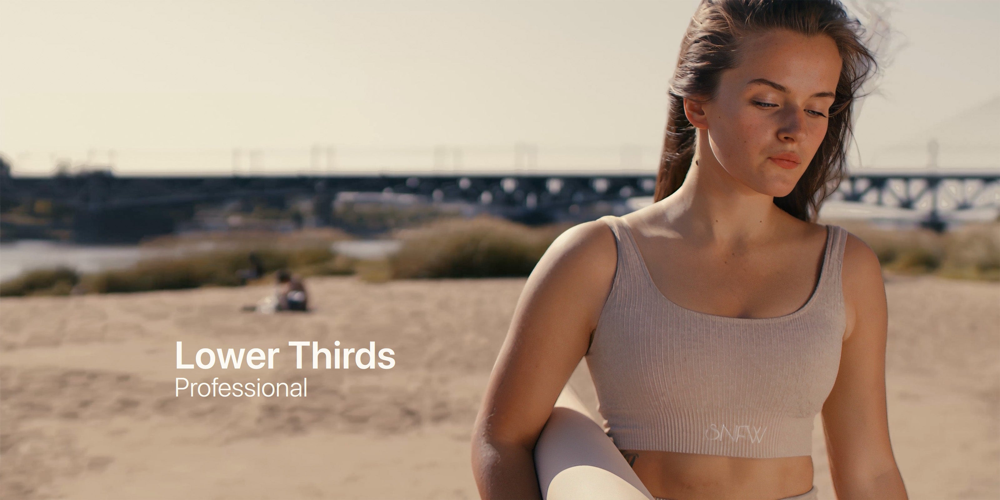
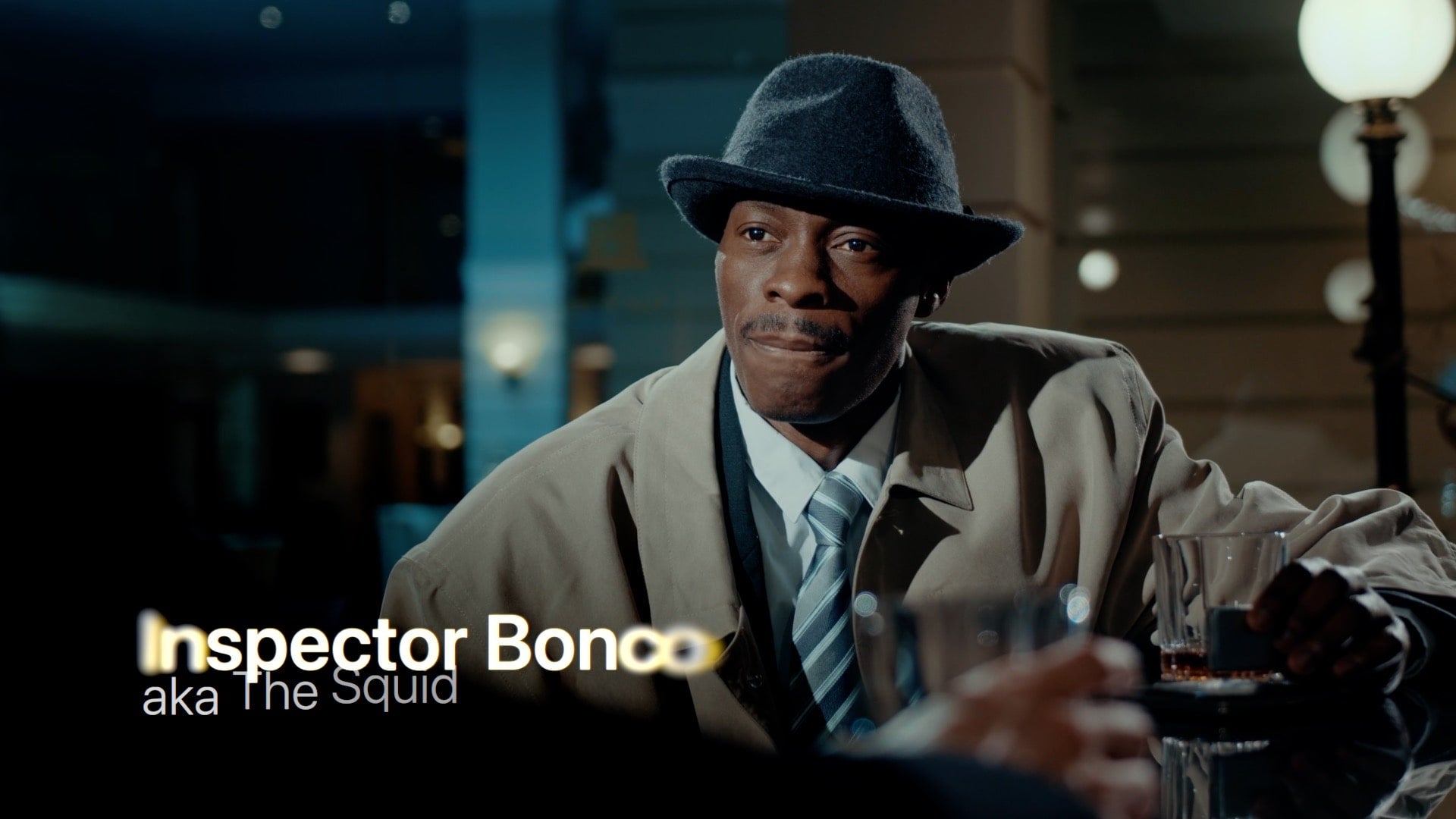
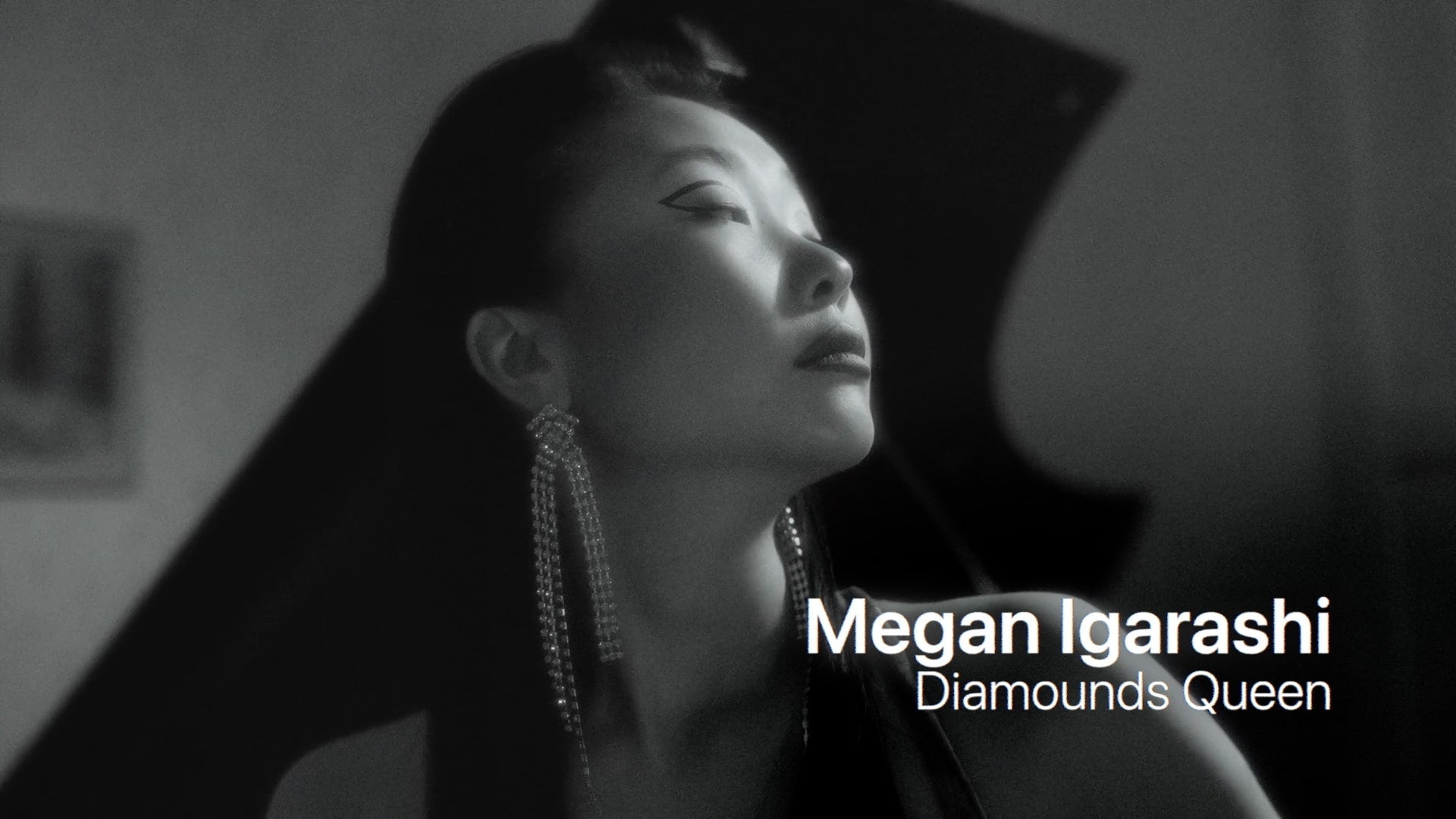
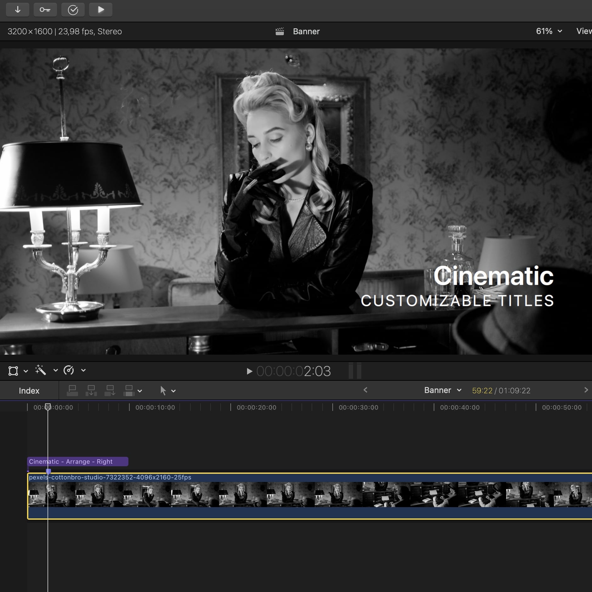
Introduce your subjects with style. Make your edit stand out through its simplicity with a range of subtle animations and a well-proportioned layout.
25 titles
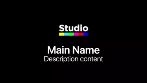
Simple Left


Simple Right


With Logo


Presets


Basic
01. Choose a title
Spot the area of your footage you want your lower third to be, it's usualy on the bottom left or right but you are free to place it wherever the contrast is not too high so your text will be readable. Navigate in the title inspector and select one of the lower thirds from the left, right or with logo category (depending on your need). Drag and drop the title over your clip in the timeline.
Basic
02. Edit text and transform
Use the on screen controls to easily change the text and transform the position, size and rotation of the title.
Advance
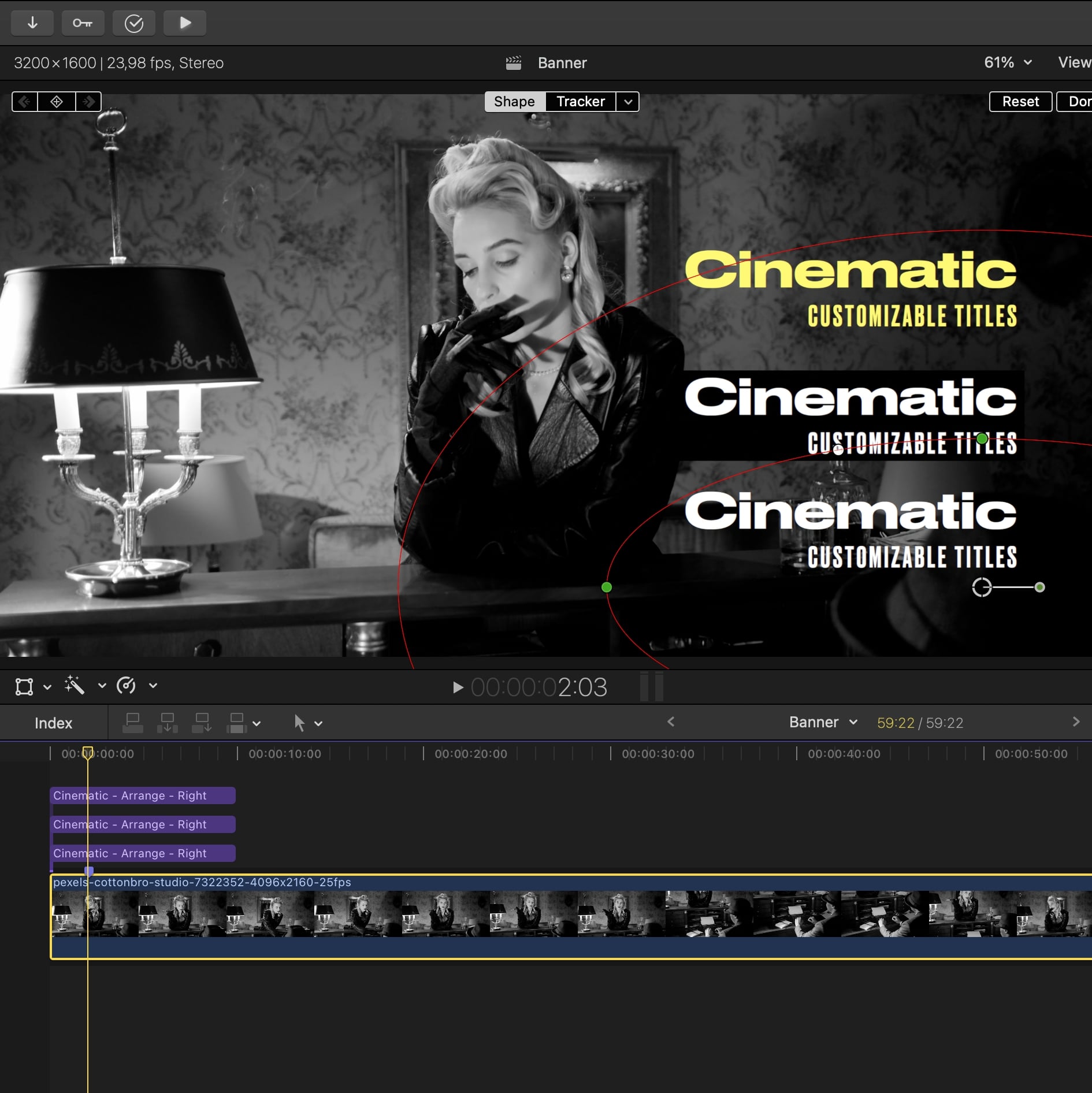
03. Change style
Let everything by default for a simple and subtle style or play with the settings to get a unic result and match the look of your edit. Change the font, color, blending mode, add a box, a shadow, etc...
Pro
04. Improve readability
The readability of the text is important, and in some cases, the background can blend with the title, making it hard to read. Here are some tricks to improve the readability of your lower thirds:
- Yellow text gives a unique vintage style and is often more readable than white or black
- A box or strong shadow can usually do the trick. You can play with the blending modes for creative results
- For a stand/stable shot, you can lower the luminosity of the corner where the title is located to make it stand out; this can be achieved in the color inspector by creating an oval shape mask.
Testimonials
Emily W.
Truly impressed !
I'm impressed with these Lower Thirds! The animations and customization options make them very versatile and stylish, I use them in all my project yet looks diferent everytime.
Sophia M.
Great tool
Thank you guys for the tips on how to improve the readability of the titles! A box with the "Difference" blending mode works everytime, it blew my mind when I started to play with the box color.
Jacob L.
The best lower thirds
The simplicity and elegance of these Lower Thirds are beyond compare. Perfect for a polished, professional look in all my projects. I wouldn't hesitate to recommend them to fellow editors.
Content and system requirement.
Specifications
25
59.3 MB
Final Cut Pro 10.3+